
The new Major League Soccer (MLS) season kicks off in just 10 days, with St. Louis City SC facing Charlotte FC on Saturday, February 21st. With the start of the season approaching, it’s time to tackle some of the major offseason topics. Each team has unveiled either a new home or away jersey for the upcoming two-year cycle, prompting a ranking of these fresh designs. There’s an absence of basic white shirts adorned only with logos, ensuring some creative variety. So, let’s dive into the rankings of these new jerseys.
30. Nashville SC – Reverb Kit
While yellow is a pleasant shade, this kit resembles a training top rather than something more vibrant or unique.
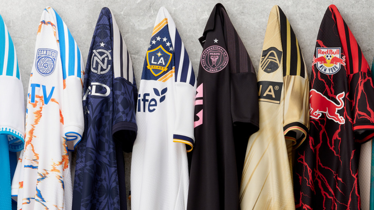
29. Inter Miami – Omen
Is this really a jersey or just a training top with ads? Miami’s stunning colors deserve a more impressive design, especially since Lionel Messi will be donning this number 10.
28. St. Louis City SC – Tina Turner Kit
Perfect for St. Louis, this jersey resembles a flowing dress that Tina Turner might wear. However, it feels less like a soccer jersey and more like a fashion statement that missed the mark.
27. Houston Dynamo – Mission Control
The idea of using a satellite image of Houston is intriguing, though it will be interesting to see how this translates on the field. For now, it doesn’t quite capture my interest.
26. San Jose Earthquake – Kit of the Dead
One of the most polarizing designs in MLS—people will either love it or loathe it. San Jose is clearly catering to their Grateful Dead fanbase.
25. Columbus Crew – Crafted for Excellence Kit
The collar elevates this from an average yellow kit, but there was still more potential for improvement.
24. San Diego FC – Unprecedented Unity Kit
This reminds me of oil spills on marble. San Diego’s strength as a team deserves a more fitting uniform.
23. New England Revolution – Independence Day
Though their badge representing fireworks is a nice touch, it feels somewhat clunky with the overall design.
22. Atlanta United – Spirit of 96
While the colors pay tribute to the Olympics well, the off-center design feels a bit unsettling rather than cohesive.
21. CF Montreal – Procure Jersey
We’re getting closer, but this jersey seems to lack a defining character. The digital elements are interesting, but they could have been more creatively utilized.
20. FC Cincinnati – Seven Hills Kit
Cincinnati’s attempt is appreciated, but the design feels somewhat disheveled. It’s certainly creative, though.
19. Colorado Rapids – Colorful Colorado
This jersey is clean, but the lack of color does not do justice to the rich burgundy associated with the Rapids.
18. DC United – Black and Red Kit
To be fair, there is red, but it falls short of standing out. The design is typical, though enhanced by nice trimming details.
17. Chicago Fire – Forever Red
Chicago’s classic red and white stripes are always recognizable, maintaining a fine balance between tradition and boredom.
16. Orlando City SC – Submerged Treasure Kit
The purple is appealing, yet insufficient contrast makes the details hard to discern.
15. Austin FC – Rooted Kit
The clean mint green looks great, but the Adidas black stripes feel a bit awkward. Austin manages to stand out without relying on traditional colors.
14. LA Galaxy – VeloCITY Kit
As an iconic American soccer brand, LA Galaxy’s home kit does justice to its legacy, even if it only makes it to the top half.
13. Minnesota United – The Decade Kit
This design successfully incorporates a sash while adding just enough color to remain interesting.
12. Red Bull New York – Rooted Kit
This black ensemble introduces a spirited element, aligning with a new era for the club under Michael Bradley.
11. New York City FC – All Nations Kit
This jersey adeptly balances design and sentimentality, honoring NYC’s diverse regions ahead of the World Cup.
10. Charlotte FC – Carolina Kit: Crown Up
Simplicity shines in this beautiful blue shade, with a crown detail adding a refined touch.
9. Seattle Sounders – Evergreen Kit
A nearly monochrome jersey is beautifully executed, with textured accents enhancing the iconic green.
8. Portland Timbers – Civic Stadium Kit
This attractive shade of green commemorates Providence Park’s 100th anniversary, boasting timeless appeal.
7. FC Dallas – DNA Kit
Dallas breathes fresh life into a classic look, with the spacing of the hoops adding visual interest.
6. Real Salt Lake – Switchback
More hoops are always welcome! This kit cleverly uses color with mountain details for a captivating overall design.
5. Vancouver – Coastal Jersey
While understated, the mountain pattern on the collar adds significant character—proving simplicity can be effective.
4. Toronto FC – Winter Kit
With a crisp appearance, this jersey captures the essence of Toronto while featuring community-representative stripes.
3. Philadelphia Union – 1776 Kit
Paying tribute to Philadelphia’s historic role in America, this jersey combines city elements with team colors in a unique way.
2. Los Angeles FC – 2026 Primary Kit
With primary colors of black and gold, LAFC focuses on detail, weaving gold throughout for a stunning look.
1. Sporting Kansas City – 18th & Vine Kit
A standout design that pays homage to the Jazz District; this kit performs beautifully in looks and age.
Fan Take: The unveiling of new jerseys adds excitement and identity to each MLS team, giving fans something to rally behind. As soccer continues to grow in the U.S., these designs not only represent the teams, but also reflect the culture and spirit of their cities.