
The 2026-27 season has kicked off in Europe’s major leagues, giving us a glimpse of teams showcasing their latest warmup gear.
The “prematch” shirt, primarily worn by players as they prepare before matches, has become increasingly important in recent years. Many clubs are dedicating significant resources to design these jerseys, often producing numerous variations or color themes that harmonize with their current home and away kits.
As the top clubs have been competing for several weeks, we’ve evaluated their prematch apparel, assessing both the hits and misses in design, from stylish to downright unattractive.
– Premier League 2026-27 kits: Ranking every jersey released
– Bayern Munich’s 2026-27 Oktoberfest kit is their boldest yet!
– Why this international break is the longest ever (and that’s a plus)
THE GOOD
Barcelona
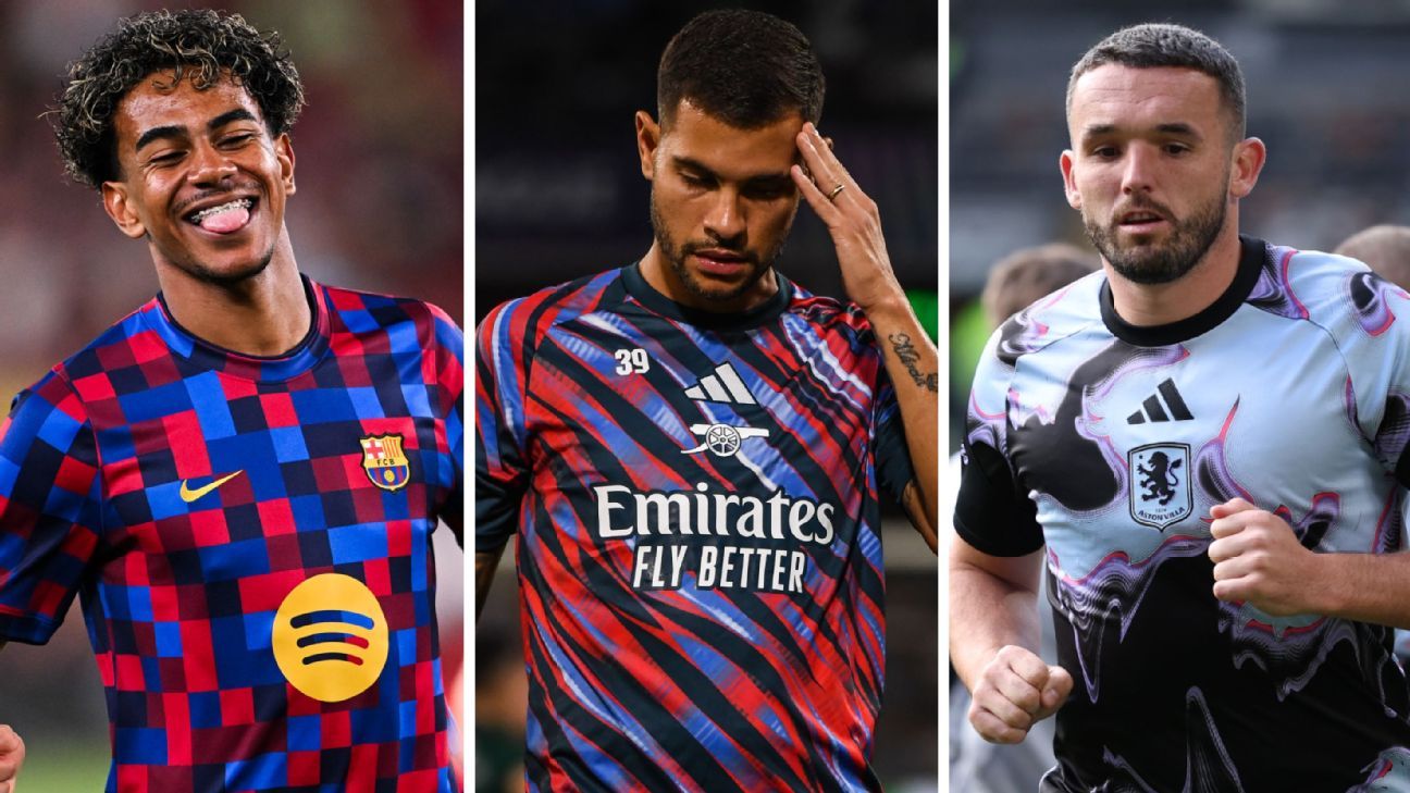
Barcelona boasts an attractive pair of home and away prematch shirts this season. The home version features a stylish checkerboard design in their iconic Blaugrana colors, while the away kit adopts a purple nebula theme, complemented by metallic logos and matte gold accents—a striking look reminiscent of Gavi’s vibrant pink hair.
Manchester United
Manchester United’s warmup top prominently features the red rose of Lancashire, illustrated in multiple silhouettes against a black background. While a single rose might have offered a simpler aesthetic, the design still strikes a thoughtful note.
Liverpool
Liverpool’s prematch shirts utilize a pattern inspired by their new away kit, presenting a textured all-red home shirt that pays homage to vintage Anfield ticket designs from the 1970s and 80s, enhancing its visual appeal.
Real Madrid
Real Madrid’s prematch shirt adopts a cohesive color palette of rosy pink and deep green, shared across all their kits this season. The design features raglan sleeves and a V-neck, with the Adidas logo and club initials (“RMCF”) showcased on the shoulders.
Paris Saint-Germain
PSG’s latest design combines their classic colors to create a striking pattern of neon purple that plays with gradients of red and blue, creating an optical illusion effect, while a large PSG crest takes center stage—a design that remains aesthetically pleasing despite its complexity.
AS Roma
Roma’s latest warmup shirt features a deep grey base with a sleek checkerboard pattern that glimmers in the light, accented in the club’s traditional colors, carmine red and golden yellow.
Inter Milan
Inter Milan’s prematch shirt features a subtle homage to classic designs, wrapped in a blue and navy triangular pattern set off by vibrant yellow logos and crests. An alternative version is available, but it’s more muted and less striking.
AC Milan
AC Milan’s new prematch jersey cleverly incorporates elements of the iconic San Siro architecture, as fragments of the recognizable cylindrical stairwells and roofline create a nostalgic and impressive design.
Wrexham
Wrexham impressively integrates their local heritage into their warmup shirt this season, featuring a leaf motif inspired by the ancient yew trees found in nearby Overton, a testament to the village’s historical significance.
THE BAD
Bayern Munich
Bayern Munich’s prematch shirt lacks any standout qualities, with a color that evokes an unsettling sensation. The unusual shade of purple seems ambiguous—neither mauve, lavender, nor lilac, creating a confusing visual impression.
Ajax
Ajax’s latest prematch shirt features a dizzying design characterized by concentric rings that radiate from the center crest, filled with abstract squiggles. The visually striking idea, inspired by their old stadium’s roofing, may cause the viewer to feel a bit confused.
Manchester City
In a bid to represent a cheerful side of Manchester’s weather, Manchester City’s prematch shirt boasts fluffy clouds and blue skies. This design is far more attractive than last season’s dreary aesthetic, although the accompanying “mash-up” version falls short of appeal.
Tottenham Hotspur
Tottenham’s latest warmup shirt opts for a pedestrian navy base with faded diagonal lines in light blue and white. While not terrible, it lacks inspiration and comes off as rather mundane.
Arsenal
Arsenal’s prematch shirt toes a line between unattractive and ugly with a design filled with erratic spikes of red, white, and pale blue. This chaos, meant to embody the anticipation before matches, elicits an uneasy feeling rather than excitement.
Atlético Madrid
Atlético Madrid’s home and away prematch shirts both feature an identical ripple pattern, representing the energy needed to gain Diego Simeone’s approval. Although the home version is already disappointing, the away shirt in black and neon green is even worse.
THE UGLY
Chelsea
Chelsea’s home prematch shirt features an overwhelming mix of pale blue watercolor patterns, surrounded by an overlarge abstract laurel design, resulting in a confusing and muddled appearance.
Aston Villa
Aston Villa’s new shirt features a warped, psychedelic rendition of their lion emblem, creating an unsettling visual experience that resembles something out of a bizarre art installation.
Leeds United
Leeds’ “white rose of Yorkshire” motif is overwhelmingly present on their new prematch shirt, augmented by an eye-popping shimmer effect, pushing the design into kitschy territory.
Juventus
Juventus’ prematch shirt features a large, clashing gold star that distracts from an otherwise simple and refined design, making it look awkward rather than striking.
Swansea City
Swansea’s latest warmup shirt presents a chaotic mix of zigzag and triangle patterns in vibrant reds, oranges, and yellows, resembling a wild goalkeeper shirt from the 90s.
Benfica
Benfica’s prematch jersey may very well be one of the least attractive designs this season, featuring a disturbing mottled pattern in clashing red and purple tones that doesn’t seem to work together at all—it appears more like a production error than an intentional design choice.
In the modern football landscape, where style is as critical as performance, the designs of team kits can spark conversations among fans and impact merchandise sales significantly. This season’s warmup attire not only showcases teams’ identities but also reflects broader trends in sports fashion, enticing fans to showcase their allegiance both on and off the pitch.
Source: www.espn.com