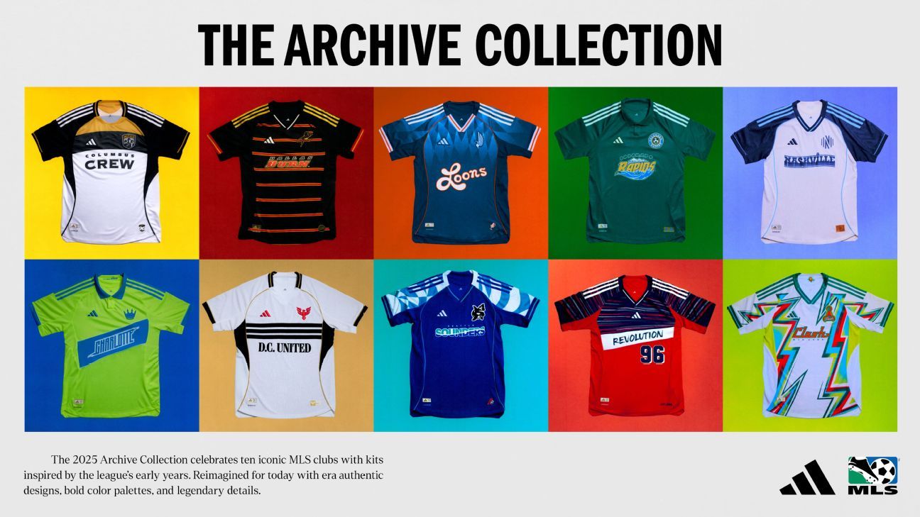
Welcome to the exciting new chapter of MLS third kits!
After years of limiting teams to just two jerseys, MLS and Adidas dipped their toes into the world of third kits last season with four retro-inspired designs. This year, they’ve ramped up the creativity, introducing an additional ten “heritage” kits alongside a unique offering from Inter Miami CF.
Though still considered a young league on the global stage, MLS is embarking on its 30th season, making it the perfect time to embrace its own history and nostalgia.
Remember those days back in 1996? Let’s explore all 11 of MLS’s third kits for 2025.
FC Dallas was the first MLS team to move away from an American-style nickname, opting for a European-inspired name in 2005, setting a trend for league names in the last two decades. Previously known as the Dallas Burn, the team has revived its unique aesthetic in its new, eye-catching third kit.
This kit draws inspiration from a 1998 jersey, featuring the club’s mascot Islamiko on the chest, alongside a vintage crest on a black background adorned with striking red and gold stripes. It’s bold yet elegant, standing out without being overwhelming; one might wonder why this design can’t be the team’s permanent look.
While Dallas’s 90s throwbacks are nostalgic, San Jose isn’t far behind in embracing the vintage vibe.
The San Jose kit pays homage to the 1996 design, featuring a half-white and half-yellow shirt with a teal triangle on the sleeves. It’s a striking combination, and while this bold throwback may not be something San Jose revisits often, it’s undeniably memorable.
Minnesota United FC hasn’t had the chance to delve deep into the club’s own history since its inception in 2010, yet they embrace colors tied to past Minnesota teams like the Kicks and Strikers.
With blue as their predominant color and a fresh orange accent, this kit captures the spirit of the state’s football legacy, making it visually striking, especially when paired with orange footwear.

Seattle has truly excelled with their retro third kit.
Everything about it screams 90’s nostalgia from the teal accents to the shoulder designs, taking us back to 1995 without feeling outdated. Plus, the incorporation of the Orca logo, introduced during last year’s brand refresh, adds a touch of contemporary flair to this nostalgic design.
It’s hard to forget that the Revolution once donned this vibrant and flashy kit throughout matches.
A blend of blue on top and red below, accentuated by a white block around the wordmark, created a unique look that may raise some eyebrows. Yet, as a third kit, it’s absolutely fitting—perfect for special occasions that harken back to sporting events of the ’90s.
8. Inter Miami
Inter Miami boasts the only third kit in MLS that isn’t part of the Heritage set, and with star Lionel Messi on the roster, they have every reason to showcase another shirt.
This design is straightforward with its same logo and sponsors, but its charm lies in its vibrant light blue and pink color scheme—perfectly embodying Miami’s tropical allure.
Nashville SC, as a new club, opts not to draw from much of a past but instead imagines what their kit might have looked like back in 1996.
The design creatively integrates denim-inspired accents with a vintage wordmark, showing originality by avoiding any history they didn’t create. However, the choice to use denim only as a secondary color means it doesn’t pop the way it could have with a more committed denim approach.
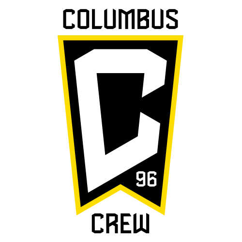
The Columbus Crew had the potential to be a top contender with their striking black and yellow combination, successfully reviving an emblem featuring three hard-hatted figures, reminiscent of the league’s early days.
However, this kit failed to draw inspiration from past designs. Lacking the bold shoulder stripes and chest designs of their earlier kits, it opts for a modern template—a missed opportunity to celebrate the club’s storied history.
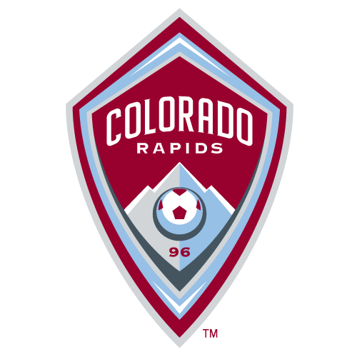
The Colorado Rapids’ burgundy and sky blue color combination is stunning, yet fans are accustomed to seeing their distinct green and blue colors since the team’s establishment in 1996.
While there was great potential for a throwback kit, the team opted instead for plain green collared shirts. This decision missed the mark; a more adventurous design was needed to better align with the club’s bold history.
Fan Take: The introduction of these third kits is significant for soccer fans as it showcases the league’s attempt to connect with its history and market creatively. This development not only enhances fan engagement but also signals a growing maturity in MLS as it aims to stand out on the global stage.