

As part of Major League Soccer’s 30th-anniversary celebrations, the league has unveiled an archive collection featuring 10 new retro jerseys representing various teams. Some designs truly capture iconic styles, while others challenge the concept of what a throwback jersey should be. For the original clubs celebrating three decades in the league alongside newly established teams, this homage makes sense, although it may not resonate for all.
This mirrors last season’s release when Inter Miami donned a throwback jersey, despite being relatively new to the league since their inaugural match in 2020. However, with Lionel Messi now on the team, expectations have shifted dramatically. This season’s collection includes jerseys from teams that have only completed a few seasons in the MLS, and as they are ranked from least to most appealing, let’s delve into the details.
10. Charlotte FC
There’s a lot happening with this design, but most of it is underwhelming. While the crown logo is noteworthy, its vibes resemble those of the Seattle Sounders. Since Charlotte played its first game only in 2022, the notion of a throwback seems misplaced despite the city’s rich soccer history.
9. Nashville SC
Unlike Charlotte, Nashville has a bit more heritage as it emerged from United Soccer League. Their jersey feels a bit like a playful nod, akin to "groovy, baby" in an Austin Powers tone. The team sports solid colors, but the usual alternative was lacking, resulting in a somewhat basic design.
8. DC United
Currently, there isn’t much excitement surrounding D.C. men’s soccer. This jersey, while historic and reminiscent of its debut season, lacks flair. It appeals to classic jersey enthusiasts but pales in comparison to others on this list.
7. New England Revolution
This isn’t a bad effort, particularly with the incorporation of the crayon flag at the top. However, it feels like it’s missing something vital to make it stand out.
6. Colorado Rapids
This minimally designed jersey is elevated by an excellent logo. It would be wonderful if the Rapids considered bringing this back permanently, as it would benefit from a revival.
5. Columbus Crew
This jersey aims for a modern look, but something feels absent. The color scheme works well, and the design aligns with the logo; however, it falls short compared to the top four.
4. Seattle Sounders
Seattle consistently delivers commendable jerseys, and this one is no exception. The love for Orca logos, combined with beautiful colors and trim, showcases their excellence in design.
3. Minnesota United
This jersey nearly snagged the top spot, thanks to its great use of numbers and gradients. Minnesota United has excelled in revisiting their legacy and implemented an impressive design that stands out on the field.
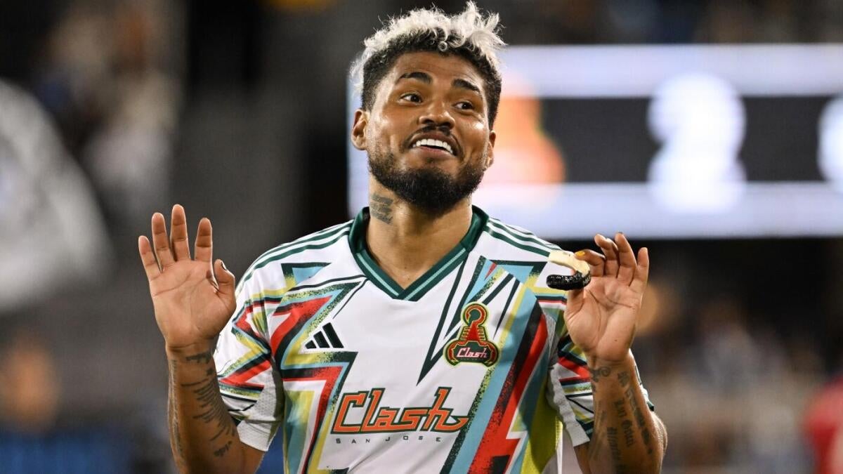
2. San Jose Earthquakes (Clash)
The term "Clash" carries a sense of nostalgia that’s sorely missed today. This jersey resonates with a bold 70s vibe—its vibrant colors may either charm or repel you, but it undoubtedly captures the essence of the era.
1. FC Dallas (Bruce)
FC Dallas hits a home run with this jersey, making it something fans wish they could see more often. While it’s a little more conservative than the Clash, it excels as a functional piece for both on-field and off-field wear, complemented by a sleek logo.
Fan Take: This release highlights the evolving identity of MLS, blending nostalgia with modern influences, a vital aspect for long-time supporters. By honoring its history while appealing to newer fans, the league fosters a deeper connection with its diverse audience and strengthens the overall soccer culture in the U.S.
