
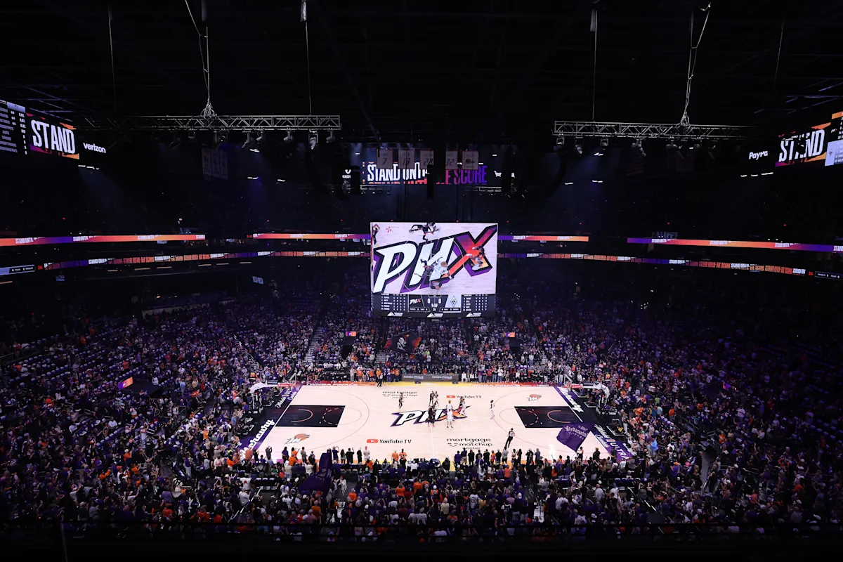
As the Phoenix Mercury approach their 30th anniversary, the original WNBA franchise is embracing a significant transformation by unveiling the first rebranding in the team’s history, which includes a fresh logo and new wordmark. This update comes as the last remaining one of the four original franchises to refresh its identity for the WNBA’s milestone 30th season in 2026, marking a new era amid soaring interest in the league.
The revamped main logo now features a purple and orange crescent moon with a stylized “M” instead of the full team name, alongside a modernized Global Logo inspired by the earth. For the first time, a secondary logo includes an outline of Arizona State with a basketball design and the nickname “Merc.” Mercury President Vince Kozar explained that the goal was to modernize the legacy brand while honoring those who shaped it, notably legends Diana Taurasi and Penny Taylor, who were involved in the process. Taurasi, in particular, has been the face of the franchise for two decades, embodying the spirit and history of the team.
This rebranding was initially planned for the 25th anniversary but is now timely given the ongoing transition in the post-Taurasi and Britney Griner era and the team’s continued success, including reaching the WNBA Finals in 2025. Ownership changes with Matt Ishbia’s 2023 acquisition of the Mercury and Suns add another layer of fresh energy to the franchise. Increasing viewership, attendance, merchandise sales, and cultural influence are pushing the league into new territory.
Kozar mentioned that the previous logo, despite a color update in 2011, lacked versatility and didn’t translate well across merchandise due to its asymmetry and dated font style. The new design seeks to balance honoring the team’s history with appealing to modern fans who appreciate sleek, contemporary branding, reflecting broader trends in the league toward refreshed aesthetics.
Among the other original franchises, the New York Liberty revamped their logo and colors after new ownership in 2020, and the Los Angeles Sparks introduced their first major logo change for their 25th anniversary in 2021. The Washington Mystics and a few other teams have retained their original logos with minor updates over the years.
The Mercury’s rebranding rollout will continue with new uniforms, a drone show celebration in Phoenix, and additional announcements. These moves coincide with ongoing collective bargaining talks between the league and players’ union, underscoring the team’s optimism and focus on the future.
Fan Take: This rebranding is a powerful statement from Phoenix Mercury that blends respect for tradition with a bold step into the future, reflecting the evolving identity of the WNBA. For fans, it signals a renewed commitment to growth, innovation, and keeping the league vibrant and relevant in an increasingly competitive sports landscape.