
The new Major League Soccer season is just 10 days away, featuring a matchup between St. Louis City SC and Charlotte FC on February 21st. With the kickoff approaching, it’s time to dive into the offseason’s most pressing questions, particularly regarding the new jerseys teams will unveil. Each MLS team has launched either a home or away kit for the season, which means it’s time to assess and rank these styles. After all, who wouldn’t want to rank their fresh new jersey?
This year’s jersey designs are an exciting mix, showcasing creativity while steering clear of boring options like plain white shirts adorned with logos. Let’s put the spotlight on the rankings and dig deeper!
### 30. Nashville SC – Reverb Kit
While yellow is a pleasant choice, this kit resembles a training shirt and feels like it could’ve been jazzed up a bit more.
### 29. Inter Miami – Omen
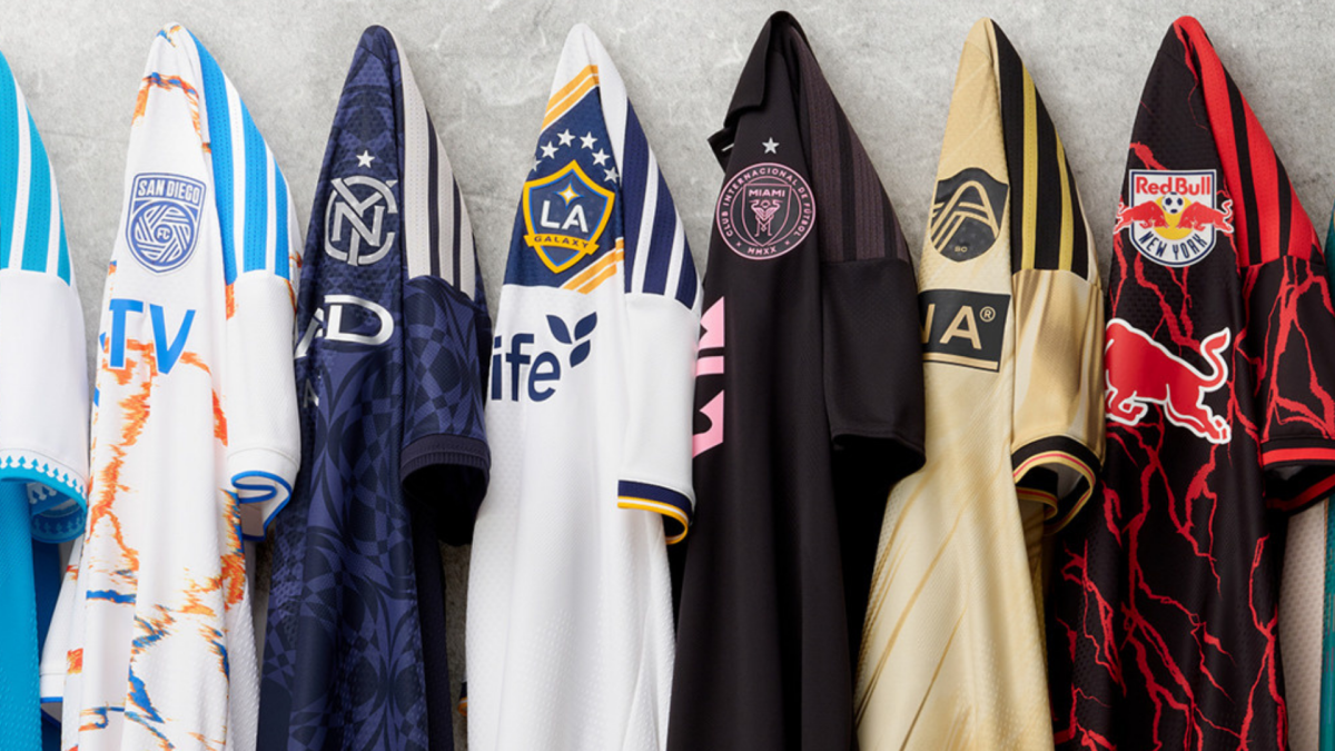
With Miami’s vibrant color palette, the design falls flat, resembling more of a training top rather than an iconic jersey, especially ahead of a season with high expectations.
### 28. St. Louis City SC – Tina Turner Kit
This kit, inspired by the “Queen of Rock and Roll,” resembles a flowing dress, but it might feel out of place for a soccer jersey, despite the homage.
### 27. Houston Dynamo – Mission Control
The concept of a bird’s-eye view of Houston is intriguing, but its execution may take some getting used to, especially when paired with the team’s traditional colors.
### 26. San Jose Earthquake – Kit of the Dead
This is a polarizing design; fans will either love or loathe it, appealing directly to the Grateful Dead enthusiasts.
### 25. Columbus Crew – Crafted for Excellence Kit
Thanks to its collar, this jersey stands out a bit more than the standard yellow but still could use further refinement.
### 24. San Diego FC – Unprecedented Unity Kit
With its oil spill look, this kit does not quite match the quality of its formidable team, needing a more refined aesthetic.
### 23. New England Revolution – Independence Day
The fireworks-themed badge is an interesting touch, but the overall execution feels somewhat heavy-handed.
### 22. Atlanta United – Spirit of 96
The vibrant colors celebrate the Olympics well, yet the off-centered stripes create a visual imbalance that detracts from the overall design.
### 21. CF Montreal – Procure Jersey
While the digital motif is appealing, the design feels incomplete, giving a sense of poor printing quality.
### 20. FC Cincinnati – Seven Hills Kit
Attempting a novel approach, the orange hues could eventually grow on fans, although the overall look feels a bit disheveled.
### 19. Colorado Rapids – Colorful Colorado
The jersey has a clean look but lacks the expected color depth, and it doesn’t showcase the team’s burgundy well.
### 18. DC United – Black and Red Kit
Although it technically incorporates red, this standard design feels too ordinary but earns points for its trim details.
### 17. Chicago Fire – Forever Red
Chicago’s classic red and white stripes are always recognizable, though this design does teeter on the edge of being unexciting.
### 16. Orlando City SC – Submerged Treasure Kit
The purple is splendid, but the lack of contrast with yellow makes some details hard to discern, maybe appearing better in action.
### 15. Austin FC – Rooted Kit
With mint green adding a fresh vibe, the black Adidas stripes feel slightly out of sync, yet the overall aesthetic remains appealing.
### 14. LA Galaxy – VeloCITY Kit
As a staple of American soccer, the Galaxy’s home kit does a commendable job of modernizing their iconic look.
### 13. Minnesota United – The Decade Kit
This design effectively incorporates a sash without overwhelming the overall appearance, showcasing an engaging color twist.
### 12. Red Bull New York – Rooted Kit
Embracing the color black with a bit of flair, this kit sets the tone for a new era with managerial changes at the club.
### 11. New York City FC – All Nations Kit
Capturing a harmonious balance in design, NYCFC celebrates its diverse regions without cluttering the jersey.
### 10. Charlotte FC – Carolina Kit: Crown Up
The beautiful blue color and subtle crown details create a pleasing aesthetic, making for a standout kit.
### 9. Seattle Sounders – Evergreen Kit
This monochrome kit shines through thanks to its thoughtful details, ensuring the logo remains prominent and striking.
### 8. Portland Timbers – Civic Stadium Kit
A stunning green, this jersey pays tribute to Providence Park’s milestone, enhanced by elegant arch details.
### 7. FC Dallas – DNA Kit
Dallas breathes new life into a classic look, effectively using spacing in the hoops to create a striking jersey.
### 6. Real Salt Lake – Switchback
Utilizing their characteristic colors, this kit makes great use of mountain motifs, resulting in an attractive overall appearance.
### 5. Vancouver – Coastal Jersey
Simplicity paired with a stylish mountain pattern lends this jersey a subtly impressive aesthetic, demonstrating that less can be more.
### 4. Toronto FC – Winter Kit
With a fresh roster and an equally updated kit, this design stands out with its clean lines and represents the local community well.
### 3. Philadelphia Union – 1776 Kit
Perfectly capturing Philadelphia’s historical essence, this unique jersey combines elements of local pride and team identity, though it might feel out of the ordinary for an extended run.
### 2. Los Angeles FC – 2026 Primary Kit
With black and gold as its primary hues, LAFC pays careful attention to detail, ensuring their kit stands out strikingly on the field.
### 1. Sporting Kansas City – 18th & Vine Kit
A standout design inspired by the Jazz District, this jersey resonates well and promises to age beautifully while maintaining its appeal.
### Fan Take:
This focus on new jersey designs is crucial for soccer fans, as fresh kits not only reflect a team’s identity but also foster a sense of connection between clubs and their fan bases. These fashion statements can influence team branding and help build enthusiasm for the season ahead, further growing the sport’s popularity in the U.S.